PANTONE Color Report Spring 2016: A Transporting and Transformative Canvas
Colors this season transport us to a happier, sunnier place where we feel free to express a wittier version of our real selves. The 2016 Pantone Color Report is out.Leatrice Eiseman, Executive Director, Pantone Color Institute™Influenced by the world of art, new global doors opening and the desire to disconnect from technology and unwind, designers this season have gravitated toward a palette that is first and foremost calming. Paying homage to the beauty of natural resources, colors emerging in the Spring collections serve as vehicles that transport wearers to more tranquil, mindful environs which encourage relaxation first, followed by curiosity and exploration.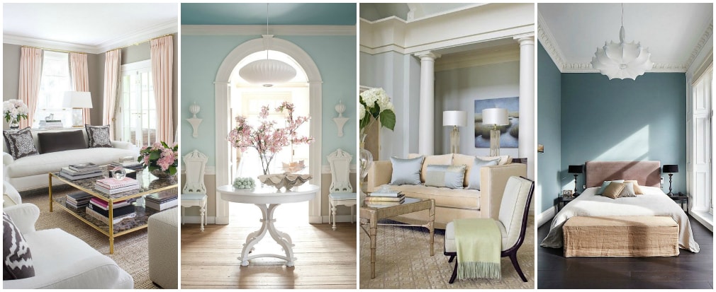
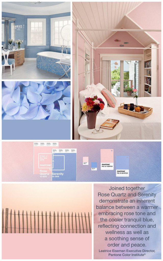
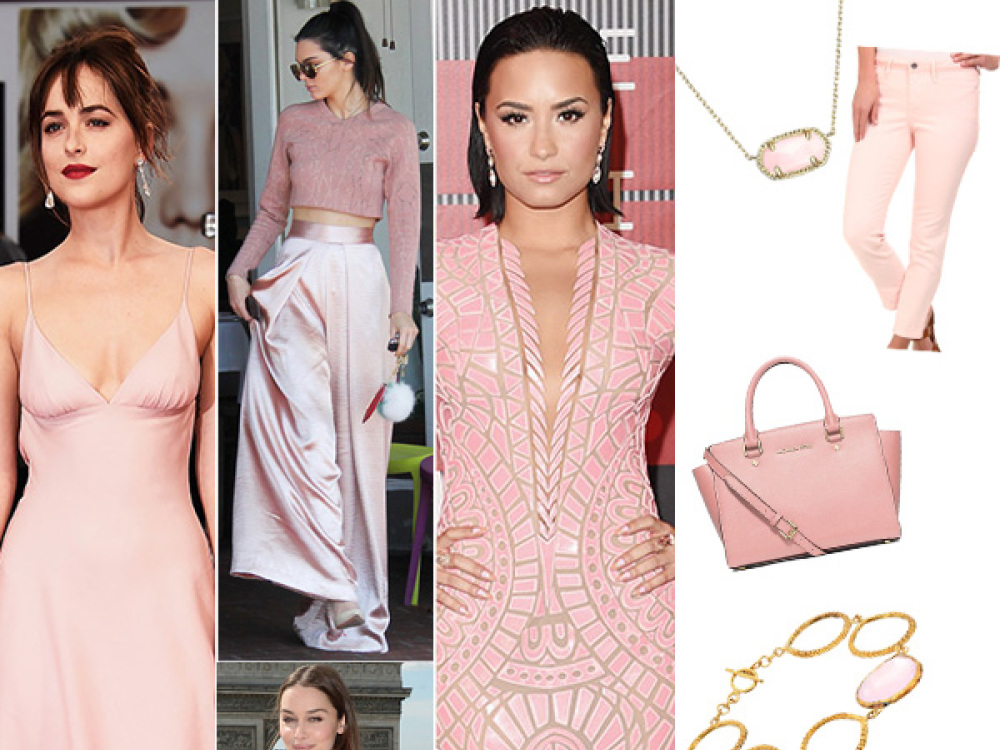
 The prevalent combination of Rose Quartz and Serenity also challenges traditional perceptions of color association.
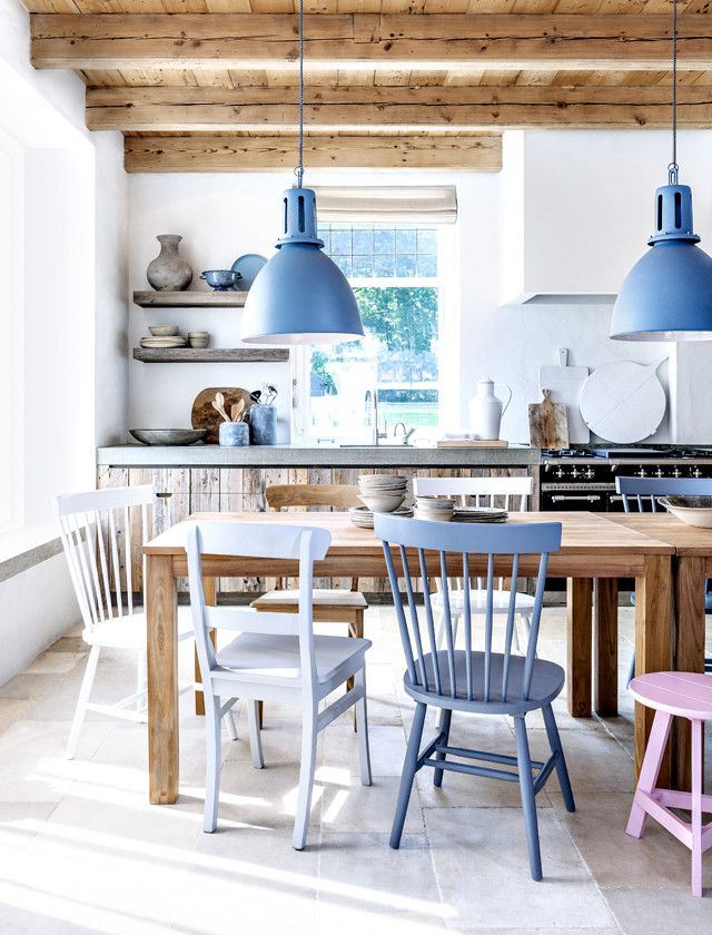
 A Unisex PaletteColors this season transcend cultural and gender norms. Vivid brights give way to excitement and optimism, though quiet stability prevails in this season’s palette. For Spring 2016 there are truly no perceivable distinctions in color choices between the men’s and women’s collections, both of which focus on a desire to breathe and reflect, then play.
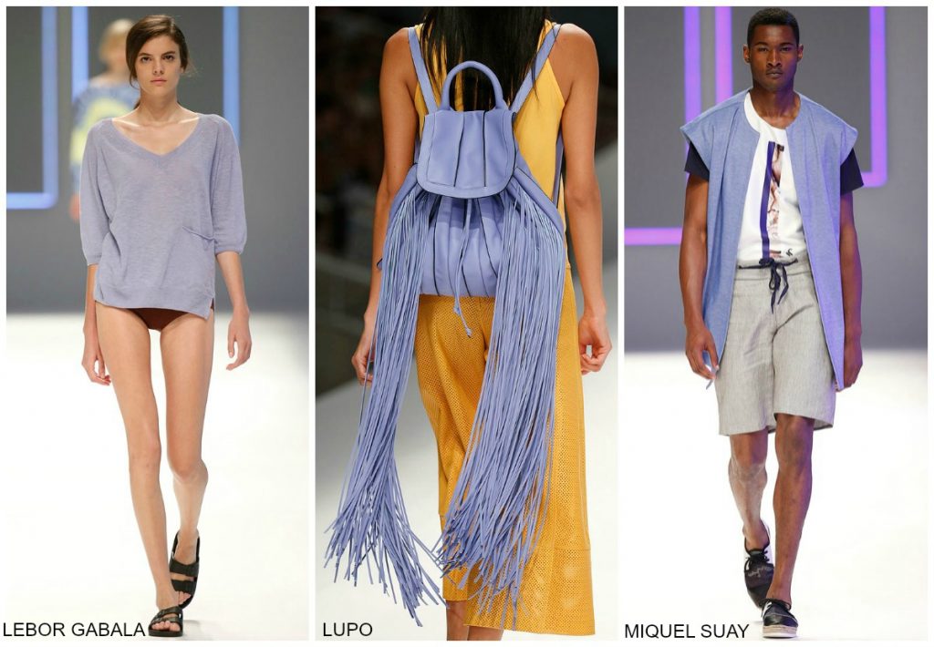
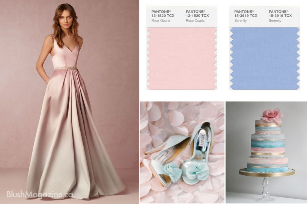
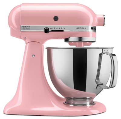
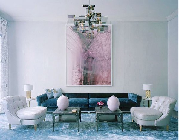
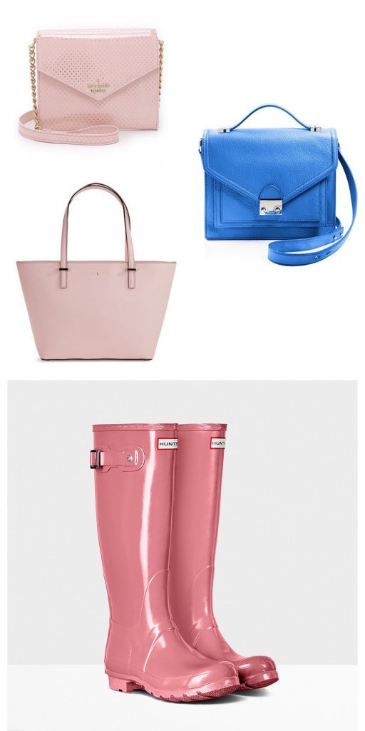 Whether in soft or hard surface material, the pairing of Rose Quartz and Serenity brings calm and relaxation. Appealing in all finishes, matte metallic and glossy, the engaging combo joins easily with other mid-tones including greens and purples, rich browns, and all shades of yellow and pink. Add in silver or hot brights for more splash and sparkle.Leatrice Eiseman, Executive Director, Pantone Color Institute_______________________________________________________________________The choice for Color of the Year varies vastly from Benjamin Moore’s – Simply White OC-117 to Sherwin Williams’ – Alabaster SW 7008. I chose to highlight the more unexpected and culturally complex color combination by Pantone. The images collected by Pantone and shown here caught my interest for their diversity and possibilities in Interior Design. As 2016 unfolds, I look forward to creating and incorporating subtle yet sophisticated color palettes.Thank you Pantone for your beautiful Inspiration! Genoveve SergeGenoveve Serge Interior Design
